
An accessible website is designed in such a way that anyone can use it without difficulty.
During the website development process, you want to make sure that the end user has the best user experience. And that includes people with disabilities or those who faces challenges when using a website.
Unfortunately, there are still websites that don't use accessibility best practices. But you can make sure yours does.
If you keep a few things in mind during the web development process, you can improve the user experience for all users, including differently abled users.
Below are some helpful tips you can use to improve website accessibility.
Add Alt Text to Images
You might have heard about the importance of adding alt text on image tags in HTML5. So how do you use them? Do you provide alt text for every image on your webpage?
Image alt text makes it easier for people with visionary disabilities to understand the content of a webpage. But you should include the alt text only for informational images that aid in the understanding of the content.
Decorative images should have empty alt text. This tells screen readers that the information provided by the image is not important and might in fact detract from the user experience.
Informational images are images that convey important information related to the content. You should be able to describe what they show in a few words of alt text.
Let's suppose we run a fitness blog and are working on creating an article about how to do a workout at home and we use the following image in our article.
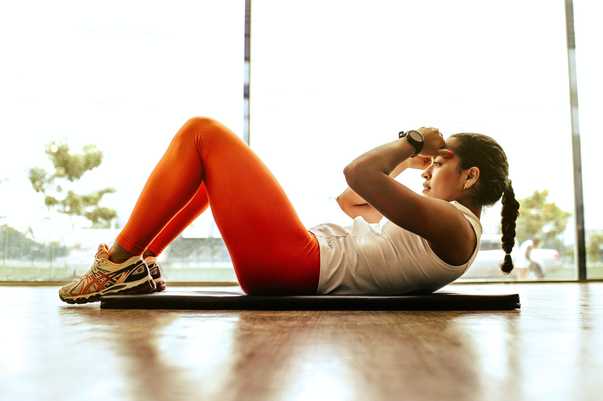
This image is supposed to convey a message to the blog readers on things you need for a crunch exercise. The alt text for this image could be something like this:
<img src="crunch_exercise.png" alt="You must have a good quality exercise mat and workout clothing to avoid back injuries and skin allergies">
The alt text we provided for our image clearly tells visually impaired users the message our image conveys.
Decorative images, on the other hand, serve the sole purpose of decoration on the webpage – maybe they just break up the content or complement general descriptions in the text.
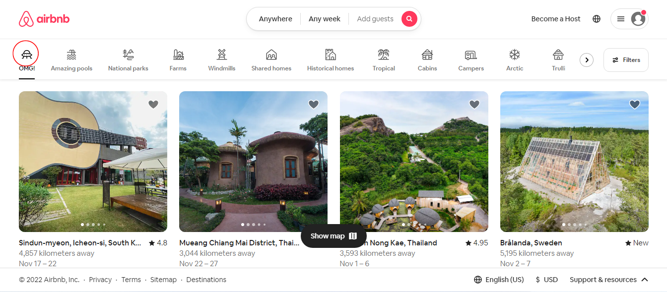
Images used as icons are a great example of decorative images. The Airbnb homepage has a navigation bar with multiple icons (like the one in the red circle) indicating different types of living spaces available at Airbnb. The icons used in the navigation bar are for decoration purposes and we can leave their alt text empty.
<!-- Example of decorative image -->
<img src="decorative_img.png" alt="">
Maintain Heading Hierarchy
If you don't use headings in the correct hierarchy (from <h1> – the biggest – to <h6> – the smallest), screen readers might assume there's some content missing.
Because of this, it is best to use <h1> for the main title only, <h2> for headings that come after the title, h3 for subheadings, and so on.
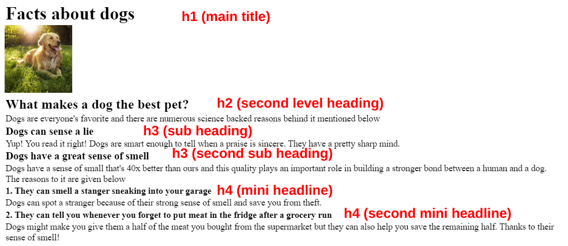
Consider the example below: we have a webpage with a few headings. <h1> is used for the document title, <h2> for the second level document heading, <h3> for subheadings and <h4> for mini headlines (headings that come after <h3>).
Below is the code for this web page. Notice the different heading tags in it:
<h1>Facts about dogs</h1>
<img src="dog.png" alt="a cute dog resting under the sun">
<h2>What makes a dog the best pet?</h2>
<p>Dogs are everyone's favorite and there are numerous science backed reasons behind it mentioned below</p>
<h3>Dogs can sense a lie</h3>
<p>Yup! You read it right! Dogs are smart enough to tell when a praise is sincere. They have a pretty sharp mind.</p>
<h3>Dogs have a great sense of smell</h3>
<p>Dogs have a sense of small that's 40x better than ours and this quality plays an important role in building a stronger bond between a human and a dog. The reasons to it are given below</p>
<h4>1. They can smell a stanger sneaking into your garage</h4>
<p>Dogs can spot a stranger because of their strong sense of smell and save you from theft.</p>
<h4>2. They can tell you whenever you forget to put meat in the fridge after a  grocery run</h4>
<p>Dogs might make you give them a half of the meat you bought from the supermarket but they can also help you save the remaining half. Thanks to their sense of smell!</p>
Use the Aria Property or Label Tag for Input Fields
Aria labels or <label> tags tell screen readers what type of information an input field expects. Without them, screen readers would not know the purpose of an input field, which would provide a bad user experience to visually disabled users.
<!-- Aria label example -->
<input type="text" placeholder="Enter your name" aria-label="Enter your name">

<!-- Label tag example -->
<label>Full Name: <input type="text" placeholder="Enter your name"></label>
Example one uses the aria property for screen readers to read what the user is expected to enter in the name input field.
Example two uses the <label> tag with text Full Name which is readable by screen readers.
Provide Keyword Functionality
Not all users can use a pointing device (mouse) yet a lot of websites do not provide keyboard functionality to users. This discourages users who only use the keyboard from returning to your website.
One simple example of this is adding a click event listener to the submit button of a form instead of making use of the onsubmit event (which requires a user to click to submit a form). Have a look at the example below:
<!-- Example one -->
<form>
	<label>Full name: <input type="text" value=""></label>
    <label>Email: <input type="email" value=""></label>
    <button onclick="handleSubmit>Submit</button>
</form>

<!-- Example two -->
<form>
	<label>Full name: <input type="text" value=""></label>
    <label>Email: <input type="email" value=""></label>
    <button>Submit</button>
</form>
Example one uses a click event listener on the submit button. This means that pressing the enter key on a keyboard would not submit the form.
Example two uses the onsubmit event and assigns a JavaScript function to that event. This way a click or an enter button both run the handleSubmit function.
Use an Accessible Color Palette
Bad color contrasts ruin the overall experience for people without disabilities as well as for those with disabilities. So it's important to get the contrast and complementary colors correct when designing your site.
There are tools like contrast checker that help you understand whether your colors contrast enough to be properly visible. Accessible color contrast helps disabled people distinguish between elements on a web page. See below the examples of good and bad color combinations.

The first box has a dark blue background which makes the white easier to read. On the other hand, the second box has a green background with pink text that is not easy to read and causes eye strain.
Provide Alternatives for Audio and Video Content
Users who cannot hear or see well might find it difficult to access the audio and video content of a website.
To offer them a better experience, provide transcripts for any audio you use, and add easy-to-read captions on your video content.
Make Sure the Content is Easy to Understand
Easy to understand content is free of unexplained jargon and technical phrases.
Suppose you run an analytics firm and are an expert in the field of data science. But your users might include current or potential clients and job seekers. These people might not have enough technical knowledge to understand content stuffed with jargon.
We are a team of analytics experts who are masters at aggregating data from all the available warehouses, detecting anomalies, performing batch processing on high volumes of data, and applying robust algorithms to solve your business needs.
The above text is full of analytics jargon that not everyone can understand. This makes you lose your visitors – as why would they invest in you if they can't understand what you do?
Check out the below simplified version of the same text that uses more approachable terms everyone can understand:
We are a team of experts who specialize in collecting data from all the available sources, identifying errors in that data, handling high volumes of data in less time with greater accuracy, and making predictions to solve your business needs.
Make sure that your content delivers its purpose in language that everyone can easily understand.
Conclusion
Accessible websites are crucial for a good user experience. An accessible website can not only grab new users but it can also encourage old users return over and over again.
There is a lot more you can do when it comes to website accessibility. But with these tips and tricks, you can improve your site or app's UX significantly.
I hope these tips help you offer a better user experience in your upcoming projects.
Develop accessible websites and make the internet a better place for everyone!
Interested in connecting on LinkedIn? Hit me up at Tooba Jamal